
Building a Feeling: Our First Gold ADDY
Some projects start with a deliverable. This one started with a feeling.
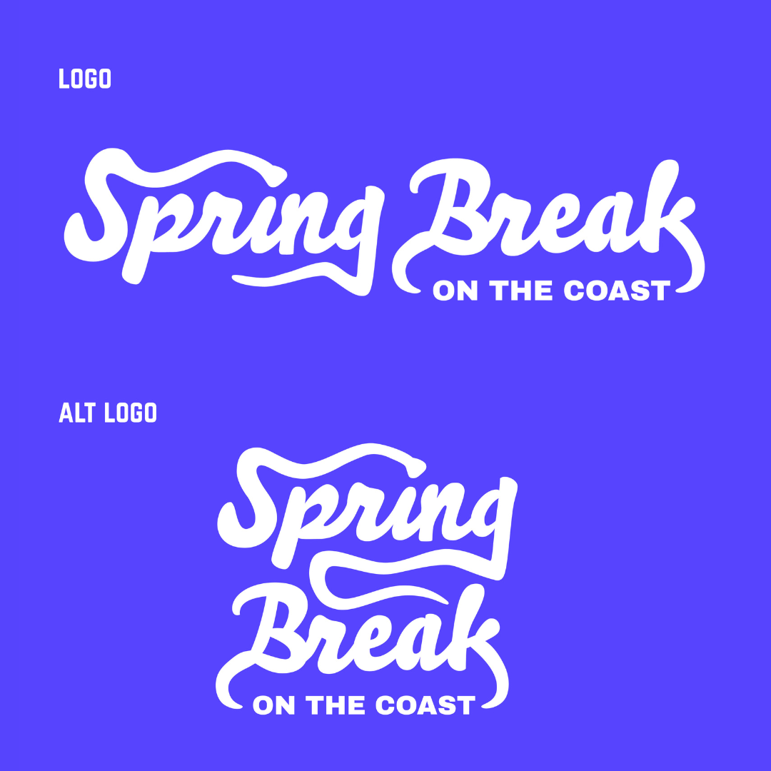
When we began building the vision for the 15th Annual Spring Break on the Coast for Concrete Street Amphitheater, the goal was to translate what it actually feels like to be there and make that visible before anyone even stepped through the gates.
If you’ve been to Concrete Street, you know it’s not just a concert, it’s an experience. It’s movement, energy, food trucks, people gathering, music carried across the venue, moments happening in every direction. Every show could be somebody’s first date, somebody’s 50th date, somebody’s birthday, and even maybe somebody’s first concert. We aim to create a memorable moment, no matter the occasion, and want them to come back to Concrete Street, time after time.
The initial goal in this campaign was to create the first moment – someone who comes across the campaign and immediately understands: this is something I want to be part of. Not because of a headline or a ticket price, but because of the atmosphere.
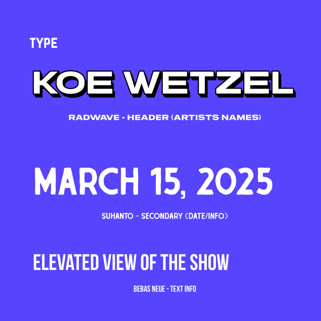
Koe Wetzel gave us a powerful thread to build around. He had played the same stage years ago as an opener for Spring Break on the Coast, and for this show, he returned as a headliner. That full-circle moment became a foundation for the story being told. It reflected what happens at Concrete Street: artists grow there, and so do the fans, giving the creative a sense of depth that extended beyond visuals.

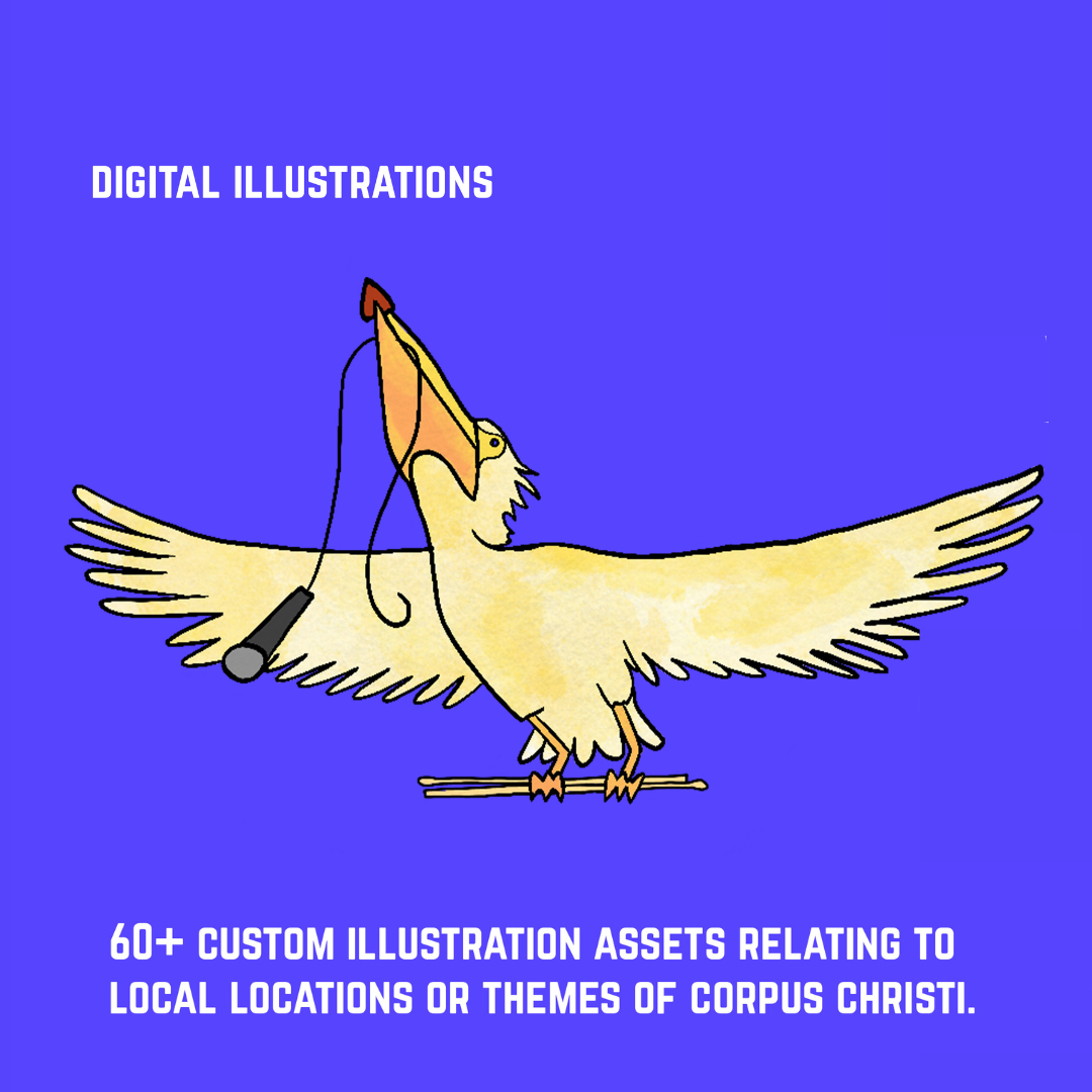
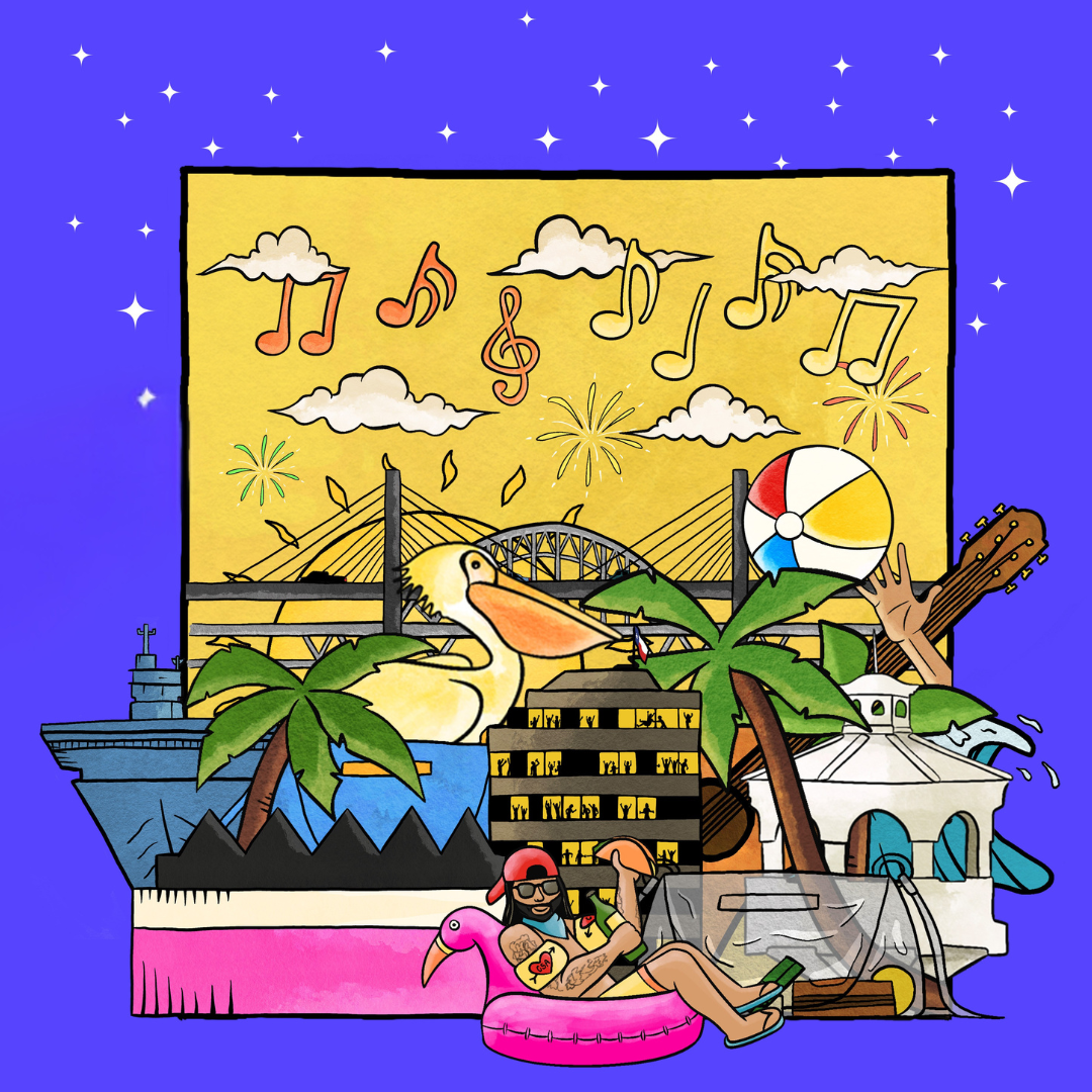
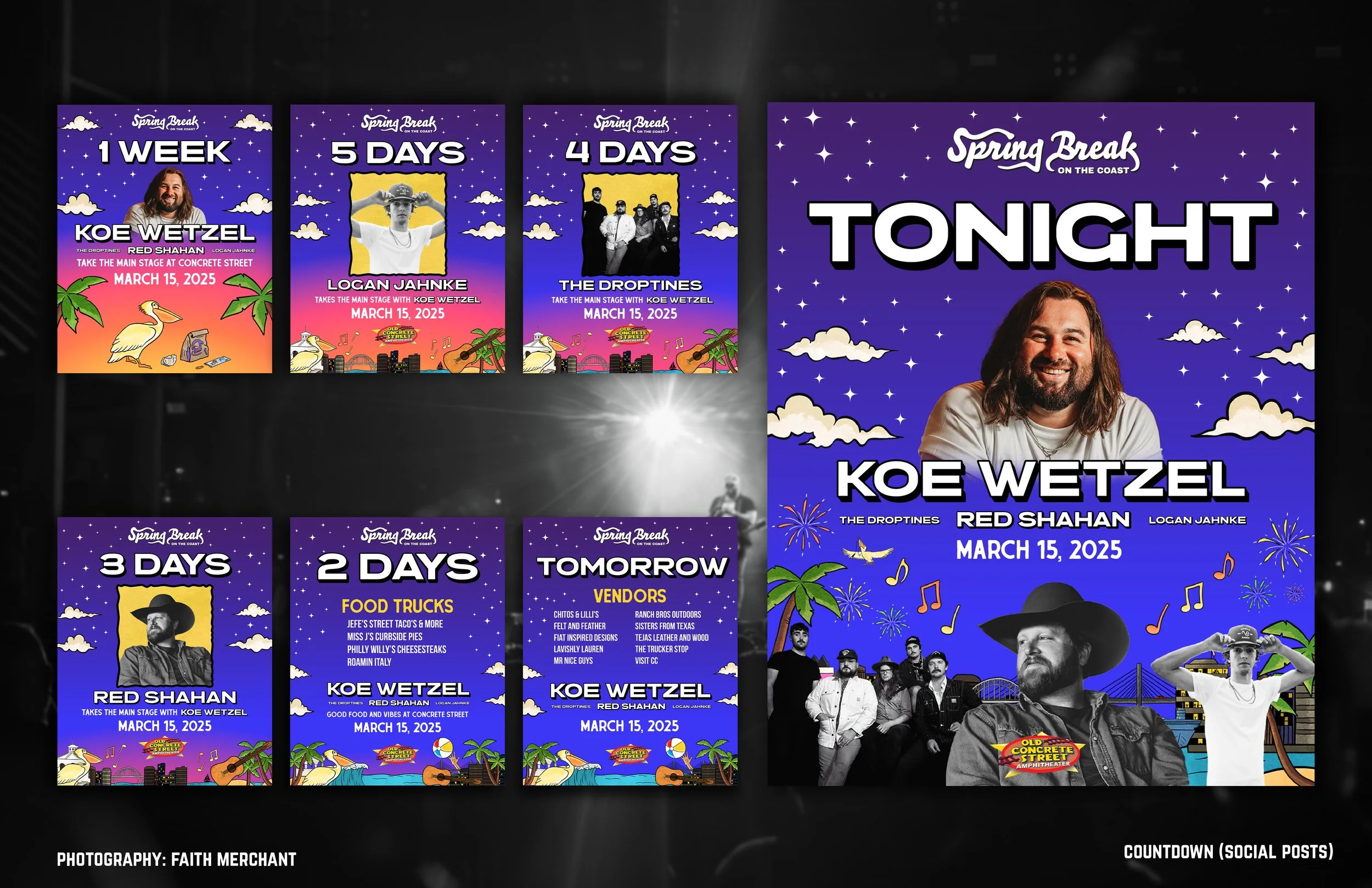
From there, the work became about building a cohesive campaign that represented what this event means to Corpus Christi. We moved into a custom-illustrated style grounded in our community, drawing on the skyline, coastline, and the city’s current transition between the old and new Harbor Bridge. We also made a deliberate decision to move away from Concrete Street’s standard brand colors to let the show stand on its own and create something that felt distinct from their typical campaigns.
As the concept developed, Bobby Rios, our Creative Manager, helped expand it into a full system. He refined the color palette, added depth, and ensured the work could scale across all placements. What started as a direction became a cohesive campaign.
There was a point where we stepped back and looked at everything together: social, posters, digital, and it finally felt like the same world, and that’s when we knew we had it. We began to focus on execution.
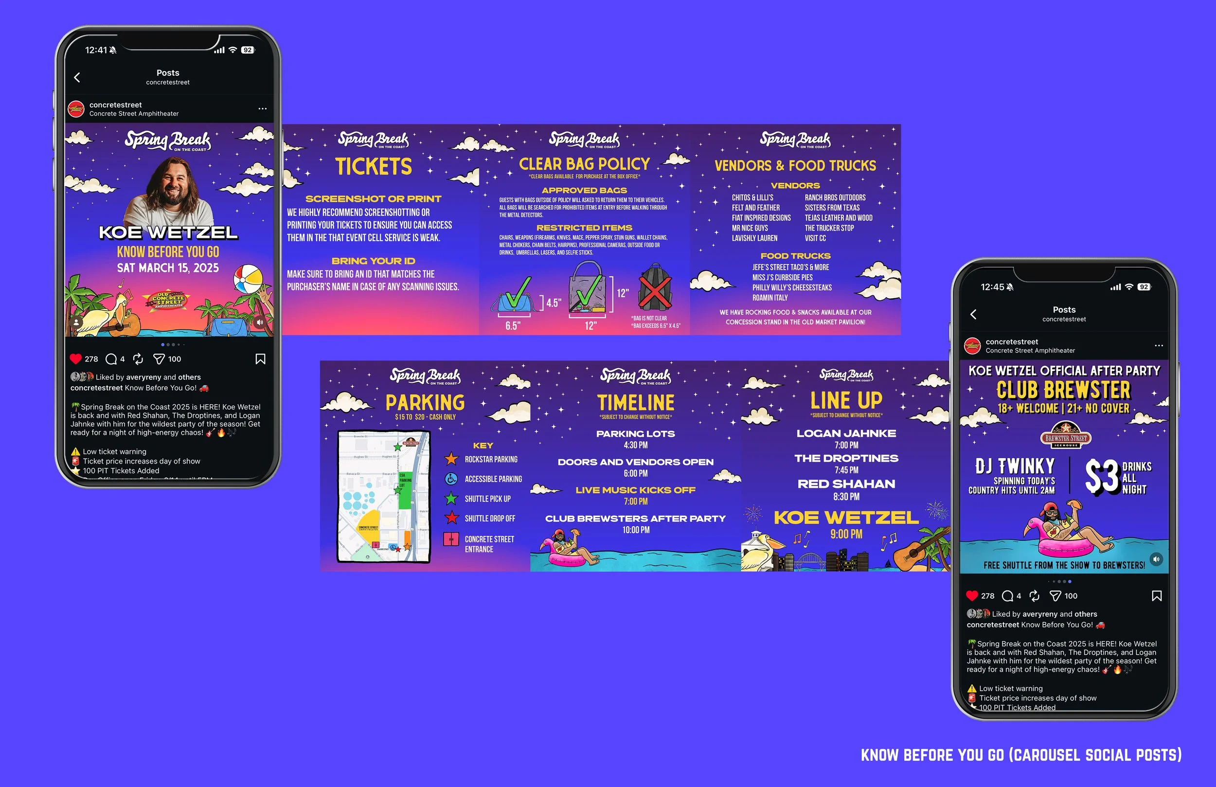
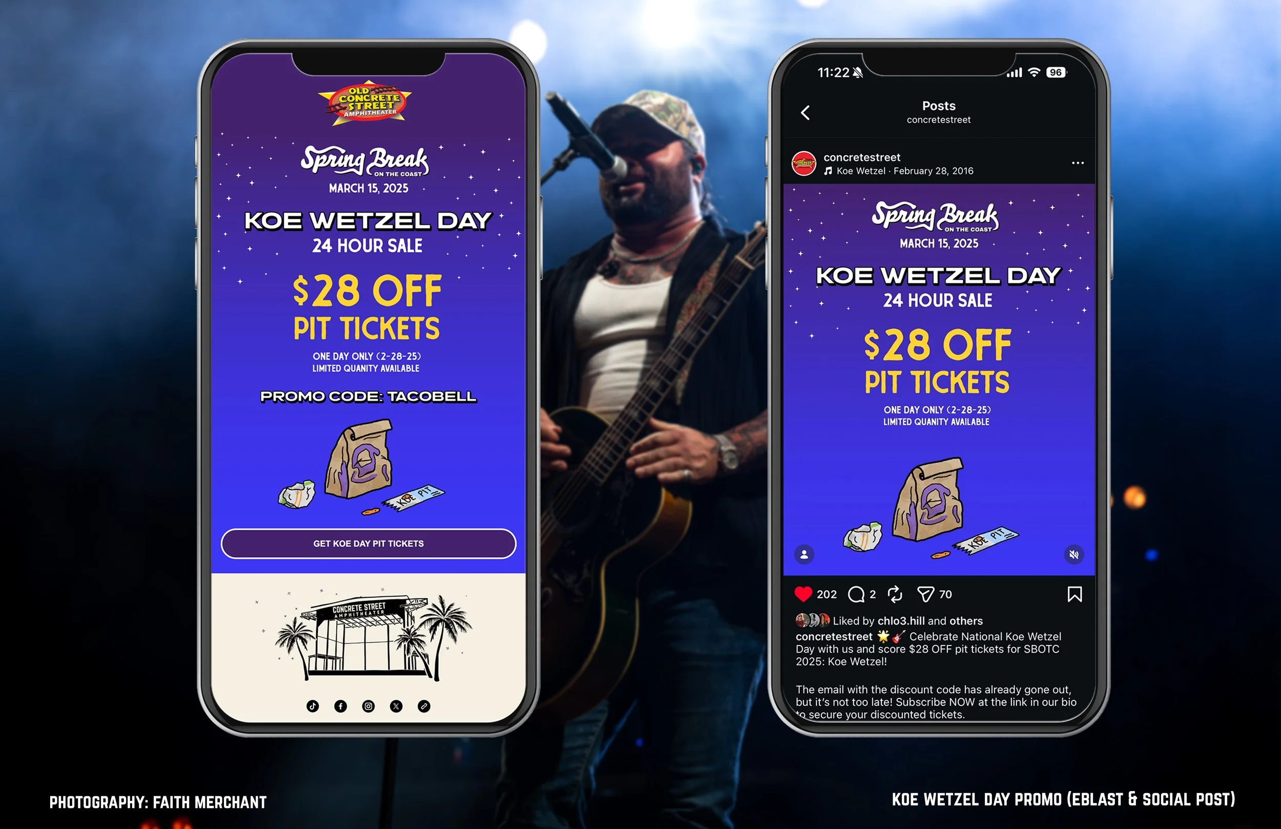
We gave ourselves room to lean into moments that felt relevant to the audience. We created touch points in the campaign that were personal to Koe Wetzel’s career, like his song, “February 28, 2016,” which references Taco Bell, lined up with a one-day ticket promotion we built around that same date. That day, known as “Koe Wetzel Day,” has in turn made him the unofficial people’s ambassador of Taco Bell. We used a custom-illustrated Taco Bell-style takeout bag as the centerpiece for that push. It was specific, timely, and tied directly back to both the artist and the audience. We even gifted him a Taco Bell Chiguagua stuffed animal and a ridiculous amount of Taco Bell sauces (that our interns traded Taco Bell employees for with tickets to the show).
These weren’t one-off ideas; they were extensions of the same visual system, designed to keep the campaign from feeling repetitive while staying consistent, but also built with intention. Assets weren’t simply resized and reused. Each platform was approached based on how people engage with it. Social required movement and variation, print needed clarity, and digital allowed for layering and motion. The goal was consistency without duplication.
All of this also had to work within a fast-moving campaign window and still drive ticket sales. The goal wasn’t just to make something visually strong; it had to perform. It had to sell tickets, build anticipation, and hold attention across multiple touchpoints, and by the time the show arrived, the marketing and the experience were aligned. We were so excited to see that what people expected matched what they walked into.
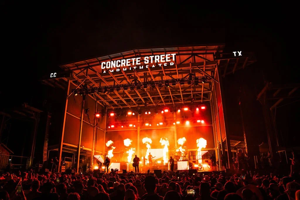
The results followed: a sold-out show, increased attendance, and strong regional draw, along with broader media coverage and measurable impact for the Coastal Bend. The project also earned our first Gold ADDY, and more importantly, it reinforced what works: clear direction, a flexible creative system, and a team that knows how to execute without overcomplicating the idea.
That’s the kind of work we’re here to do, and we’re just getting started.
-Marisol Ramirez